How Do I Choose The Right Paint Colors For Home Renovations In 2023?
October 8, 2023 | by Geralt Soon

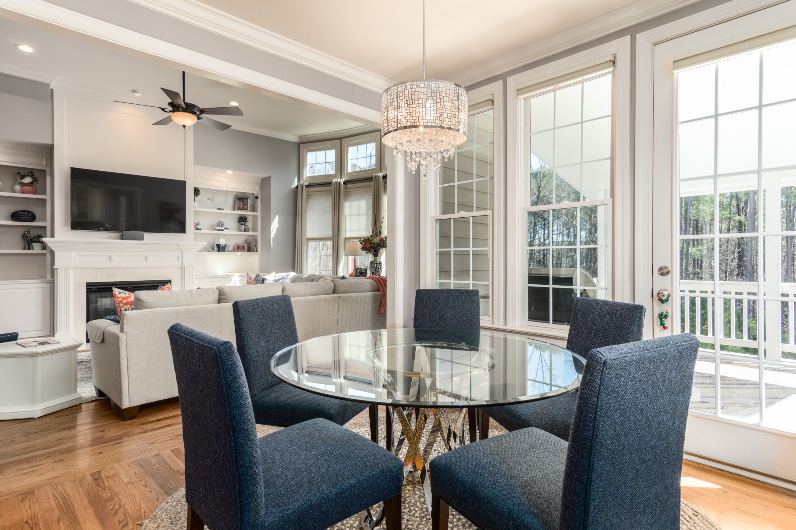
Looking to give your home a fresh new look in 2023? Choosing the right paint colors for your home renovations can make all the difference in creating a space that reflects your personal style and brings joy to your everyday life. With so many options out there, it can be overwhelming to know where to start. But fear not, because in this article, we will walk you through some key tips and tricks to help you navigate the world of paint colors and make the perfect choice for your home. So grab a cup of coffee, sit back, and get ready to transform your space with the power of color!
Factors to Consider for Choosing Paint Colors

1.1 Personal Preference
Choosing the right paint colors for your home can be an exciting process, as it allows you to express your personal style and create a space that reflects your taste. Personal preference plays a crucial role in deciding the colors that you find appealing and enjoyable to live with. Take some time to think about the colors that make you feel happy and comfortable. Consider whether you prefer bold and vibrant shades or soft and subtle tones. Remember, you will be spending a significant amount of time in your home, so it’s essential to select colors that you genuinely love.
1.2 Home Style and Architecture
Another factor to consider when choosing paint colors is the style and architecture of your home. Different architectural styles have their own color palettes that are commonly associated with them. For example, a modern and contemporary home often features clean lines and a minimalist aesthetic, which can be complemented by neutral and monochromatic colors. On the other hand, a traditional and classic home may look stunning in rich and warm hues like deep reds and earthy browns. Consider the overall design and style of your home when deciding on paint colors to create a cohesive and harmonious look.
1.3 Lighting
The lighting in your home plays a crucial role in how paint colors appear. Natural light, as well as artificial lighting fixtures, can significantly affect the appearance of colors and their undertones. It’s important to consider the direction and intensity of the light source in each room when selecting paint colors. Rooms with ample natural light may benefit from lighter shades as they can make the space feel more open and airy. On the other hand, rooms with limited natural light may benefit from warmer and brighter colors to create a cozy and inviting atmosphere. Take the time to observe how the lighting changes throughout the day to ensure that you choose colors that look their best in all lighting conditions.
1.4 Room’s Function
When choosing paint colors, it’s crucial to consider the function and purpose of the room you’re painting. Different colors can evoke different emotions and have varying effects on our mood. For example, vibrant and energetic colors like oranges and yellows may be well-suited for a home office or exercise room as they can promote productivity and enthusiasm. In contrast, soothing and calming colors like blues and greens may be more suitable for bedrooms or living rooms where relaxation is the primary goal. Think about how you want each room to feel and choose colors that align with that purpose.
1.5 Existing Furniture and Decor
If you already have furniture and decor in the space you’re painting, it’s important to consider how the new paint colors will complement or contrast with these existing elements. Take note of the colors and patterns of your furniture, curtains, rugs, and artwork. Choose paint colors that harmonize with these existing pieces to create a cohesive and visually pleasing look. You may also consider using paint colors that help highlight or accentuate specific features or objects in the room. Keep in mind that you can always update your furniture and decor, but considering their influence on color choice can save time and effort in redecorating later.
1.6 Trends and Personal Style
While it’s essential to consider your personal style and preferences when choosing paint colors, it can also be helpful to be aware of current trends in the world of interior design. Trends can provide inspiration and ideas for colors, patterns, and finishes that you may not have considered otherwise. However, it’s important to approach trends with caution and ensure that they align with your personal style and the overall aesthetic of your home. Remember, trends come and go, but your home should reflect your unique personality and be a space that you feel comfortable in for years to come.
Understanding Color Theory
2.1 Primary Colors
When it comes to paint colors, it’s essential to have a basic understanding of color theory. The primary colors, which include red, blue, and yellow, are the foundation of all other colors. These colors cannot be created by mixing other colors together and are used as building blocks for creating a wide range of shades and tones.
2.2 Secondary Colors
Secondary colors are created by mixing two primary colors together. The secondary colors are orange (red + yellow), green (blue + yellow), and purple (red + blue). These colors can be used to add depth and variety to a color scheme and are often found in nature-inspired palettes.
2.3 Tertiary Colors
Tertiary colors are created by mixing a primary color with a nearby secondary color. For example, mixing red (primary) with purple (secondary) creates shades like burgundy or maroon. These colors are often used to add nuance and complexity to a color scheme and can create a sense of depth and richness in a space.
2.4 Warm and Cool Colors
Colors can be categorized as either warm or cool, which refers to the psychological and emotional associations they evoke. Warm colors (such as red, orange, and yellow) are often associated with energy, warmth, and excitement. Cool colors (including blue, green, and purple) are often associated with calmness, tranquility, and relaxation.
2.5 Complementary Colors
Complementary colors are two colors that are opposite each other on the color wheel. When placed together, complementary colors create a dynamic and visually appealing contrast. For example, blue and orange are complementary colors. Using complementary colors in a room can create a vibrant and energetic atmosphere.
2.6 Monochromatic Colors
Monochromatic color schemes involve using different shades and tones of a single color. This creates a harmonious and cohesive look as all the colors stem from the same base. Monochromatic color schemes are often used to create a sense of tranquility and simplicity in a space.
Popular Paint Color Trends for 2023
3.1 Neutral Colors
Neutral colors are timeless and versatile, making them a popular choice for interior design. Shades of white, beige, gray, and greige (a blend of gray and beige) can create a clean and sophisticated look in any room. Neutral colors provide a blank canvas for furniture and decor, allowing them to take center stage.
3.2 Earthy Tones
With a growing emphasis on sustainability and connection to nature, earthy tones have become increasingly popular in interior design. Colors inspired by the earth, such as warm browns, rich greens, and natural terracotta, bring a sense of calmness and grounding to a space.
3.3 Jewel Tones
Jewel tones are deep, saturated colors that resemble precious gemstones. These rich and luxurious colors, such as emerald green, sapphire blue, and amethyst purple, can add drama and elegance to a room. Jewel tones are often used as accent colors to create a focal point or to add an element of opulence.
3.4 Pastel Colors
Soft and delicate pastel colors continue to be a popular choice for those seeking a light and airy aesthetic. Pastel pinks, blues, and greens can create a calming and soothing atmosphere, perfect for bedrooms or living spaces. They can also help to make a room feel more spacious and inviting.

3.5 Moody Hues
Moody hues are deep, dark colors that create a sense of mystery and intimacy. Shades like charcoal gray, navy blue, and deep burgundy can evoke a sense of drama and romance. Moody colors work well in rooms where you want to create a cozy and intimate ambiance, such as a dining room or master bedroom.
3.6 Metallic Finishes
Metallic finishes, such as gold, silver, and copper, have become increasingly popular in interior design. These finishes add a touch of glamour and sophistication to a room. Metallic accents can be incorporated through furniture, decor accessories, or even as a paint color itself. They can create visual interest and catch the light, adding a subtle sparkle to any space.
Creating a Cohesive Color Palette
4.1 Choosing a Dominant Color
When creating a cohesive color palette, it’s essential to choose a dominant color that will tie the room together. This color will be the main focus and will typically appear on large surfaces like walls or floors. Select a color that complements the overall style and desired atmosphere of the room.
4.2 Accent Colors
Accent colors are used to add visual interest and depth to a color scheme. These colors should complement the dominant color while providing contrast and variety. Accent colors can be incorporated through furniture, decor, or smaller paint elements such as trim or an accent wall.
4.3 Harmonizing Colors
Harmonizing colors are additional colors that work well with both the dominant and accent colors. They help create a sense of balance and unity in a space. Harmonizing colors can be used in smaller doses, such as in upholstery fabrics, artwork, or decorative accessories.
4.4 Consideration for Open Floor Plans
If you have an open floor plan where multiple rooms flow into one another, it’s crucial to create a color palette that harmonizes throughout the space. Choose colors that complement each other, ensuring a seamless transition from one area to the next. Consider using a consistent color for the main living areas and incorporating variations of that color in each room.
4.5 Connecting Spaces
When planning a color scheme for your home, it’s important to consider how the colors will interact and flow from one room to another. Choose colors that create a sense of cohesion and connection between spaces. You can achieve this by either using similar colors or by using colors that have a common undertone.
Sampling and Testing Colors
5.1 Importance of Sample Testing
Before committing to a color, it’s crucial to sample and test it in your space. Colors can appear differently depending on lighting, surrounding elements, and your personal perception. Testing paint colors on your walls allows you to see how they interact with the room’s lighting and how they complement your furniture and decor.

5.2 Utilizing Paint Swatches
Paint swatches are small samples of paint colors that you can get from a home improvement store. They are an invaluable tool when it comes to color selection as they allow you to see how the color looks in your space. Place the swatches on the wall and observe how they change throughout the day due to different lighting conditions.
5.3 Painting Test Areas
To get a better sense of how a color will look in your space, paint small test areas on the wall. Choose areas that receive different levels of light throughout the day, such as near windows or corners. This will give you a better understanding of how the color will appear in various lighting conditions.
5.4 Observing Color Changes in Different Lighting
As mentioned earlier, lighting plays a significant role in how paint colors appear. Observe the test areas at different times of the day to see how the colors change under different lighting conditions. Natural light, as well as artificial lighting, can alter the appearance of colors, highlighting certain undertones or toning down others.
5.5 Considering the Time of Day
When observing the test areas, pay attention to how the colors look during different times of the day. Morning, midday, and evening lighting can significantly affect the perception of colors. Take note of how the colors make you feel and how they contribute to the overall atmosphere of the room at different times.
5.6 Evaluating Color Combinations
If you are considering using multiple colors in a room, it’s essential to test how they work together. Paint test areas of different colors adjacent to each other to see how they complement or contrast with each other. This will help you determine if the color combination achieves the desired look and feel for your space.
Practical Tips for Choosing the Right Colors
6.1 Start with Smaller Rooms
If you’re unsure about which colors to choose or feel overwhelmed by the decision, consider starting with smaller rooms. Bathrooms, powder rooms, or offices are excellent spaces to experiment with bolder or unique color choices. Working in smaller spaces allows you to be more daring without overwhelming your entire home.
6.2 Consider the Mood
When choosing colors, consider the mood or ambiance you want to create in each room. Decide whether you want the space to feel relaxing, energizing, cozy, or sophisticated. Different colors evoke different emotions, so select colors that align with the desired mood of the room.
6.3 Reflecting Natural Light
If your home receives a significant amount of natural light, it’s important to consider how the colors will interact with that light. Lighter colors can make a room feel more spacious and airy, while darker colors can absorb light and create a more intimate atmosphere. Think about the natural light conditions in each room and choose colors that will enhance the space.

6.4 Using Color Wheel Tools
Color wheel tools can be incredibly helpful when choosing colors, especially for those who may not have a natural instinct for color coordination. Color wheel tools can help you identify complementary colors, harmonizing colors, and variations of a color to create a balanced color palette. These tools can be found online or at your local paint retailer.
6.5 Seek Professional Advice
If you feel overwhelmed by the color selection process or want to ensure that you make the best choices for your home, don’t hesitate to seek professional advice. Interior designers and color consultants have expertise in creating cohesive and visually appealing color palettes. They can help you navigate the many options and provide guidance based on your personal style and the specific characteristics of your home.
6.6 Don’t Be Afraid to Take Risks
While it’s important to consider factors like personal preference, style, and lighting when selecting paint colors, don’t be afraid to take risks. Paint is a relatively easy and affordable way to transform a space, and it can always be changed if you’re not satisfied with the results. Don’t be afraid to experiment with bold or unconventional colors and have fun with the process. After all, it’s your home, and it should be a reflection of your unique personality and style.
Color Psychology and Emotion
7.1 Impact of Color on Mood
Color can have a profound impact on our mood and emotions. Bright and vibrant colors like yellow and orange can evoke feelings of energy and happiness, making them suitable for spaces where activity and socialization occur. On the other hand, cool and calm colors like blue and green can promote a sense of relaxation and serenity, making them ideal for bedrooms or spaces where you want to create a tranquil ambiance.
7.2 Creating Different Ambiances
Colors can be used strategically to create different ambiances in a room. Warm colors can create a cozy and inviting atmosphere, while cooler hues can make a space feel more serene and spacious. Consider the mood and purpose of each room and choose colors that align with the desired ambiance.
7.3 Color Choices for Specific Rooms
Different colors may be more suitable for specific rooms in your home. For example, cool and soothing colors like blues and greens are often used in bedrooms to promote relaxation and sleep. Warm and energetic colors like reds and yellows are commonly used in kitchens and dining areas to stimulate appetite and conversation. Consider the function of each room and choose colors accordingly.
7.4 Psychological Effects of Common Colors
Different colors can evoke different psychological effects. For example, red is often associated with passion, energy, and excitement. Blue is often associated with calmness, trust, and reliability. Green is associated with nature, growth, and balance. Understanding the psychological effects of common colors can help you choose colors that align with the desired emotional and visual impact in your space.
7.5 Color Associations and Symbolism
Colors are often associated with specific emotions or symbolism. For example, white is often associated with purity and innocence, while black is associated with sophistication and elegance. Blue is often associated with trust and reliability, while yellow is associated with happiness and optimism. Consider the associations and symbolism of different colors when selecting paint colors to create a certain mood or aesthetic in your home.

7.6 Using Colors to Create Focal Points
Colors can also be used strategically to create focal points in a room. By using a bold or contrasting color on an accent wall or a specific architectural feature, you can draw attention and create visual interest. Focal points can help anchor a room and highlight specific elements or objects you want to showcase.
Working with Different Interior Styles
8.1 Modern and Contemporary Homes
Modern and contemporary homes often feature clean lines, minimalism, and neutral color palettes. Colors like whites, grays, and blacks are commonly used to create a sleek and sophisticated look. Accents of bold colors, such as red or blue, can be incorporated to add visual interest and a touch of personality.
8.2 Traditional and Classic Homes
Traditional and classic homes often embrace rich and warm colors, such as deep reds, earthy browns, and regal blues. These colors are used to create a sense of elegance and timelessness. Soft neutral colors like cream or beige can also be used as a backdrop to allow traditional furniture and decor pieces to shine.
8.3 Industrial and Rustic Interiors
Industrial and rustic interiors often feature a combination of cool and warm tones. Colors like gray, black, and raw wood finishes are commonly used to create an industrial aesthetic. Rustic interiors often incorporate warm earth tones like burnt orange or deep yellow to create a cozy and inviting atmosphere.
8.4 Minimalist and Scandinavian Designs
Minimalist and Scandinavian designs focus on simplicity, functionality, and natural elements. These styles often utilize a neutral color palette, such as whites, grays, and light pastels. These colors create a sense of openness and tranquility and allow natural textures and materials to take center stage.
8.5 Eclectic and Bohemian Decor
Eclectic and bohemian decor embrace a mix of colors, patterns, and textures. These styles encourage creativity and self-expression. Deep jewel tones like emerald green, royal blue, and fiery reds are often used to create a bohemian look. Utilizing a mix of colors and patterns allows for a vibrant and visually exciting space.
8.6 Coastal and Tropical Themes
Coastal and tropical themes often utilize a light and airy color palette to create a sense of relaxation and vacation. Colors like crisp whites, soft blues, and sandy beiges can evoke a coastal or beach-inspired aesthetic. Accents of vibrant turquoise or coral can be incorporated to add a pop of color reminiscent of tropical surroundings.
Considerations for Exterior Paint Colors
9.1 Architectural Style and Historical Context
When choosing exterior paint colors, it’s important to consider the architectural style and historical context of your home. Certain styles, such as Victorian or Colonial, may have traditional color palettes associated with them. It can be helpful to research the original color schemes used during the time period your home was built to ensure a cohesive and historically accurate look.
9.2 Neighborhood and Surrounding Environment
The neighborhood and surrounding environment of your home can also influence your choice of exterior paint colors. Consider the overall aesthetic of the neighborhood and choose colors that complement the surrounding homes. Additionally, take into account the natural elements and landscape surrounding your home, such as trees, vegetation, or bodies of water, as they can influence how colors appear.
9.3 Highlighting Architectural Features
Exterior paint colors can be used to highlight and enhance the architectural features of your home. Consider using a different color for elements such as window trim, doors, or architectural accents to make them stand out. This can add depth and visual interest to your home’s exterior.
9.4 Durability and Weather Resistance
The exterior paint colors you choose should not only be visually pleasing but also durable and weather-resistant. Exterior paints are designed to withstand the elements, such as rain, UV rays, and temperature changes. Research and choose paint products that are specifically formulated for exterior use to ensure long-lasting results.
9.5 Curb Appeal and Resale Value
Consider the curb appeal and resale value of your home when choosing exterior paint colors. Certain colors are more universally appealing and can enhance the overall aesthetic and value of your home. Neutral colors or classic color combinations are often preferred for their timeless appeal.
9.6 Complementing Roof, Windows, and Landscape
When selecting exterior paint colors, take into account the color of your roof, windows, and surrounding landscape. These elements already have an established color palette, and your paint colors should complement and harmonize with them. For example, if your roof has warm-toned shingles, consider choosing paint colors with warm undertones to create a cohesive look.
Strategies for Colorful Accent Walls
10.1 Purpose of Accent Walls
Accent walls are a popular way to add visual interest and create a focal point in a room. They can help break up large spaces, highlight architectural features or create a backdrop for a piece of artwork or furniture. Accent walls can be painted in a bold or contrasting color, or even have a different texture or pattern.
10.2 Choosing the Right Wall for Accenting
When deciding which wall to accent, consider the layout and function of the room. Choose a wall that naturally draws attention or one that is a dominant feature in the space, such as the wall behind a bed in a bedroom or the wall behind a fireplace in a living room. Accent walls can also be used strategically to create a sense of balance, such as in a room with asymmetrical architecture.
10.3 Selecting a Bold Color or Pattern
When it comes to accent walls, don’t be afraid to make a statement. Bold colors or patterns can add drama and visual interest to a space. Consider using colors or patterns that complement or contrast with the other walls in the room to create a harmonious yet eye-catching look.
10.4 Creating Balance with Surrounding Walls
While accent walls are meant to stand out, it’s also important to ensure that they harmonize with the surrounding walls. Consider how the colors or patterns of the accent wall will interact with the adjacent walls. Keep the overall color palette in mind and choose a color or pattern that creates a harmonious balance in the space.
10.5 Coordinating Decor and Furniture
To create a cohesive look in a room with an accent wall, consider coordinating the decor and furniture with the colors or patterns on the accent wall. Choose complementary colors or patterns for curtains, rugs, throw pillows, and other decor elements to tie the space together. This will create a cohesive and visually pleasing look.
10.6 Accent Wall Alternatives
If you’re not comfortable with the idea of painting an entire wall in a bold color or pattern, there are alternative ways to create an accent wall. Consider using wallpaper, wood paneling, or even a large piece of artwork to create a focal point. These options can add visual interest and dimension to a room without committing to a permanent color change.
Choosing the right paint colors for your home can be an exciting and creative process. By considering factors such as personal preference, home style, lighting, and room function, you can create a color palette that perfectly suits your space. Understanding color theory and popular color trends can help you make informed decisions and achieve a look that is both visually appealing and emotionally satisfying. Remember to sample and test colors before committing, seek professional advice if needed, and don’t be afraid to take risks and experiment with different colors. With careful consideration and a little creativity, you can transform your home with the power of paint.
RELATED POSTS
View all

How Can I Find Reliable Contractors For Home Renovations In 2023?
September 29, 2023 | by Geralt Soon
What Are The Most Popular Flooring Options For Home Renovations In 2023?
October 5, 2023 | by Geralt Soon